The Most Important Principles for Interior Design
Lately, most of us have been spending pretty much all of our time at home, but even when we’re not living through a pandemic, our homes are still an important place of retreat and comfort for us.
A lot of us tend not to think too much about what the inside of our house actually looks like. We generally tend to take a bit of a more practical approach when we are deciding what to fill the rooms up with. We go for the things that we need and then we don’t think all that much more about it. A lot of the time, that has to do with our budget, too, but there is that sense that if it serves a function, it will do.
But interior design is actually more important than that. And in these days, where we are at home a lot more often than we normally would be, it is especially important for us to pay attention to how our house looks inside. There is actually a bit of a science behind it, and we are subconsciously more comfortable if our surroundings look a certain way. We must consider things like the floor being dark as if resembling the earth, the ceiling being bright like the sky, and the carpeting being a neutral shade the brings everything together.
We tend not to get tired of an appropriate interior design because our brains are wired to acclimate to it. And if you walk into a house that isn’t well designed, you will get a sense of something being wrong about the design even if you can’t necessarily figure out what.
So, let’s think about some of the basic principles of interior design that you have to keep in mind:
Proportion/Scale
 In the context of interior design, proportion and scale are really two different things but they are both extremely important. When we talk about proportion, we are referring to the size of certain items of furniture, carpet, and other aspects compared to the entirety of the space.
Scale is in reference to the individual items as they are compared to other individual items. What’s obvious about this is something like you shouldn’t have a couch so big that you can’t walk around your living room. What might not be so obvious is the finer details of scale and proportion which you may not see in action when you step into a room, but which you will be very well aware of if the room wasn’t put together by a knowledgeable designer.
Something to keep in mind is an Ancient Greek tradition that is still used by a lot of architects and designers today known as the golden ratio. It was first observed in a mathematical context, but it has a number of other practical applications, too. For interior design, you should consider the golden ratio in terms of how much space in your room you actually use. Furniture should fill up no more than 60% of the room and you should consider color on a 60/30/10 scale.
If you are working with three different colors, one of them should make up 60% of the whole of the room, one should make up 30% and the other should make up 10%. This isn’t necessarily gospel of course, but it’s effectiveness on human comfort in a space has been measured. And you should trust those Ancient Greek folks anyway — they knew what they were doing!
Balance
You’ll come to realize that these principles are all quite similar in their function for the room, it’s always about the visual makeup of the space and how that will typically affect a person’s natural level of comfort.
 When we talk about balance, we’re talking about the fact that everything you put in a room has a visual weight. It’s like when you’re on a plane and the feeling of weightlessness makes you feel like you’re off-balance. It’s about equilibrium, and it’s different in the sense that having a room that doesn’t have the visual weight evenly distributed isn’t going to cause you to get motion sickness, but it can give you the feeling that the room is not balanced and make it difficult to settle.
So, there are a few important aspects of this, first of which is a sense of symmetry. Imagine the room being split into two with the sides mirroring each other. A couch that’s centered against one wall, so it’s evenly distributed on each side.
A dining table with two chairs on each side directly facing each other. Simple enough to achieve, but very important. And then there’s radial balance. This one is less straightforward but think of it like having a focal point of a room. It’s like how in a solar system you have the sun right at the very center with all of the planets and moons spread out as if radiating from it. It gives the environment a sense of grounding as if you’re not lost in an empty space. Of course it is nice to have room to move around, but if you have like a coffee table at the center of the room or a round dining table which everything else surrounds, it can help you give the room this focused feeling.
Details
 Everything up to this point has been more about the bigger picture, so let’s scale down a little and think about the finer details here because in a lot of ways, they are just as important to the overall feel of the room.
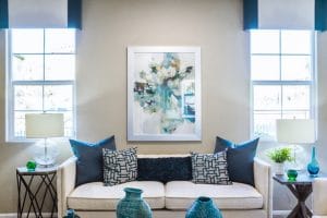
Balance, scale, and proportion are of course extremely important for the reasons we’ve already detailed but focusing purely on those things and nothing else will only serve to make the room feel a bit monotonous. Once you’ve worked out how well everything fits together, it’s time to work on the smaller stuff which will personalize the environment. Things like artwork, ornaments, the colors of the furniture, and style of things like lampshades and ottomans.
What you have to remember with all of these things is that you must avoid overcrowding the room and keep the aforementioned color balance in mind too. You still need to make sure that colors aren’t clashing and that you’re not overshadowing certain items with vibrant color. Pay close attention to the paint you use and make sure if you are using a few different colors that they’re suited to each other.
And with all of this in mind, the final important thing to consider is harmony. Make sure you focus on all of these elements in equal amounts and that they all complement each other.


